Tuesday 27 February 2018

Histogram Lab

High key


Histogram

a. Most of the pixels are actually centered, however if I had to choose id say there more to the left then the right.
b. No It doesn't look like it would lose any detail as most of the pixels are centered and there are none that are falling off any of the sides.
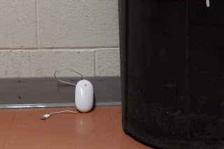
Low Key


Histogram


a. Most of the pixels are on the left of the histogram but not completely off
b. Maybe a bit would print without detail, however most of the pixels are very much on the left and just slightly off the edge.

Mid tone


Histogram


a. Most of the pixels are either on the left or centered.
b. No you wouldn't lose any detail because all of the pixels are on the chart and none are falling off.

g. I do think my camera did a pretty good job of exposing the low key and high key scene because none of the pixels fell off either side. some are very far to one side however there all off the edges.
h. The mid tone photo had the best dynamic range. Its the most spread out over the entire histogram. 


Tuesday 13 February 2018

ISO Lab


100 @ Low f/9.0 1/5 sec


100@Standard f/9.0 1/5 sec


100@high f/9.0 1/5 sec


800@low f/9.0 1/30 sec


800@standard f/9.0 1/30 sec

800@high f/9.0 1/30 sec


6400@Low f/9.0 1/350 sec


6400@Standard f/9.0 1/350 sec


6400@high f/9.0 1/350 sec

I believe the in camera noise reduction didn't make as much of a difference as I thought it would. As you go higher you do lose a little bit of detail but not enough to make a large difference unless your very zoomed in. In conclusion I don't think I would use it unless on a very high ISO just because I don't think it makes much of a difference on this camera.

White Balance

Auto WB Color is just about perfect more on the blue side by a bit


Shade WB Color is more Yellow then normal


Fluorescent WB Color is obviously way too cold


Wrong WB (cloudy) Color is almost nice but a lot more on the yellow side then normal. The background starts to look more of a tan grey rather then the light blue color that it is supposed to be. It gives it a lot more of a summer feel because of the warmth then if it was on a different setting.

Tuesday 6 February 2018

Aperture


 Aperture: f/20
ISO: 400
Shutter 1/80
Shallow 
Aperture: f/4.0
ISO: 100
Shutter Speed: 1/640

Effects: In the shallow depth of field the hat is almost more clear and all your attention is on that not only thanks to the focus but also because of the contrast. The low aperture makes the clouds look like they blend into the background as well as there more blurry. Although this is usually my favourite to shoot still life I don't really like how it makes the clouds look.
Medium
Aperture: f/11
ISO: 100
Shutter Speed: 1/400

Effects: Although the hat still pops with the medium depth of field because of the contrast its not as prevalent as the shallow DOF. The background isn't perfectly sharp but its a lot clearer then the first. You can see this the best by looking at the building in the background on the left. I also feel as though theres not as much detail on the hat.  Despite that this is still my favourite of the three because of the clouds. There not so crisp and clear that its harsh and ugly because of the color. It almost looks as if it was takin with a long exposure because of the softness in the clouds.

Deep 
Aperture: f/22
ISO: 400
Shutter Speed: 1/250

Effects: This is my least favourite of the three. The hat is almost just as important as the rest of the background making the contrast the only thing bringing attention to the hat. The clouds are more harsh and crisp bringing out the darker and not as attractive color in them. Again just like the medium DOF the detail on the hat also doesn't pop out as much.

Shallow
Aperture: f/6.0
ISO: 800
Shutter:  0.5"

The Shallow depth of field brings a lot more attention to the subject. It also blurs the background a bit more in order to bring the viewers eyes to the subject.

 Deep 
Aperture: f/20
ISO: 1600
Shutter: 4" 

The deep depth of field assures that theres detail spread throughout the image rather then just on the subject. The easiest way to notice is the line on the wall in the background. In this photo its more in focus where as the first is more blurry.